Buyagift Giftcard Flow redesign
How research-led design and a strategic MVP test delivered
a 7% uplift in gift card sales — in two weeks.
Type
End-to-End Design
My Role
Senior Product Designer
Industries
Gifting, E-commerce
Duration
Phase 3, in build
Context
The product, the problem.
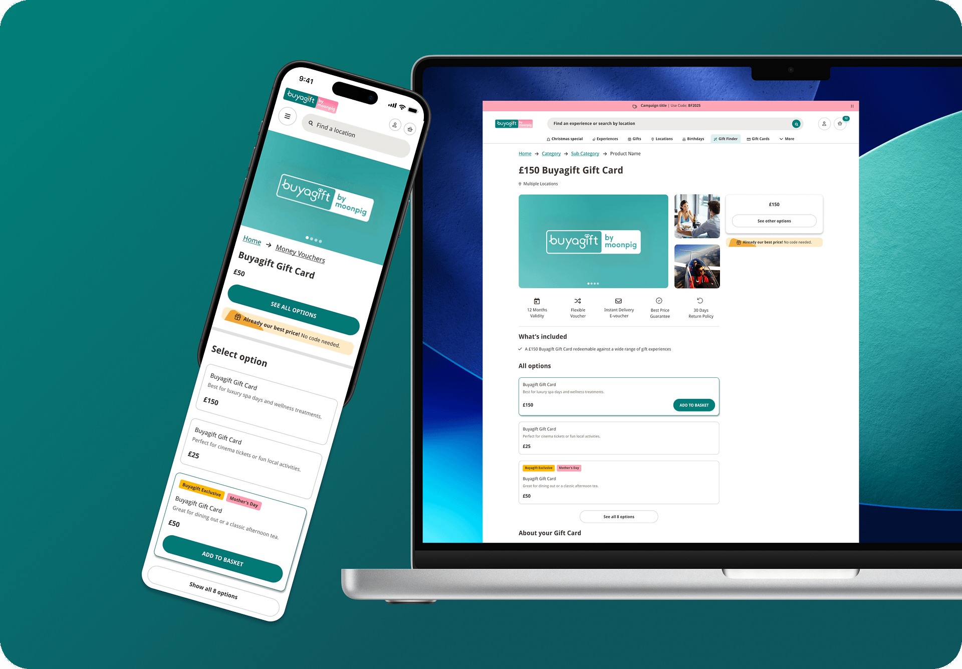
Buyagift is one of the UK’s leading experience gifting platforms. Gift cards are a significant revenue line: they let customers give someone the freedom to choose their own experience.
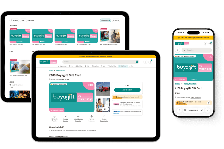
The gift card PDP was functional. Users could purchase. But the experience was limited to a single denomination SKU, spread across multiple pages, with no personalisation capability at all.
Users weren’t confused.
They were under-served.
What the page offered
One denomination at a time. Multiple page
navigation. No message. No design choice.
No personalisation.
No Moonpig integration.
What users expected
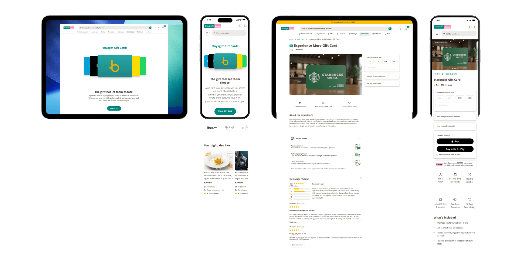
All options on one page. The ability to personalise the gift. A complete, coherent
journey from selection to delivery.
How I worked.

Discover
Playbook UX research sessions.

Define
Insights, HMW, success criteria.

Develop
Full vision + constrained MVP.

Deliver
Fake door live for 2 weeks, Iteration on results. Phase 2 now in development.
Discover phase.
I ran unmoderated research sessions through Playbook UX, giving users real tasks on the existing gift card page and listening to what they said, and what they didn’t.
The findings were consistent across sessions.
85%
of users wanted all denomination
options visible on a single page
73%
expected to personalise the gift
in-flow: message, design, or both
68%
described the current experience as
feeling good but “incomplete”
Three patterns emerged.
01
Discoverability
Users wanted all denominations visible at once: no extra navigation, no drop downs. The pill selector pattern was mentioned unprompted.
02
Personalisation
Adding a message or choosing a design wasn’t a nice-to-have. Users expected it. Without it, the gift felt impersonal and transactional.
03
A complete journey
Users didn’t want to switch context. Select, personalise, message, deliver – all in one place.
A gift purchase should feel like one coherent act.
I want to feel like I’m giving a proper gift, not just sending a voucher code.
— Eloise, 37, Playbook UX session

Define phase.
Before jumping into solutions, I wanted a clear problem statement, one the
whole team could orient around, and that would guide every design decision
that followed.

How might we

make choosing and personalising a gift card feel as joyful and complete as choosing the experience itself?
Success looked like
Gift-givers in a hurry with intent. They know they want to give a gift card: they don’t want friction, indecision, or a journey that makes the gift feel cheap. They’re emotionally invested in the act of giving.

All options on one screen
Users can see and select any denomination without
leaving the page

Personalisation in-flow
Message and design selection happen before
checkout — no detours

Measurable uplift
Increase in gift card conversion rate and/or sales
volume

Develop phase.
I designed the experience I knew users needed, before constraints came into the picture.
This was the north star that all subsequent decisions were measured against.
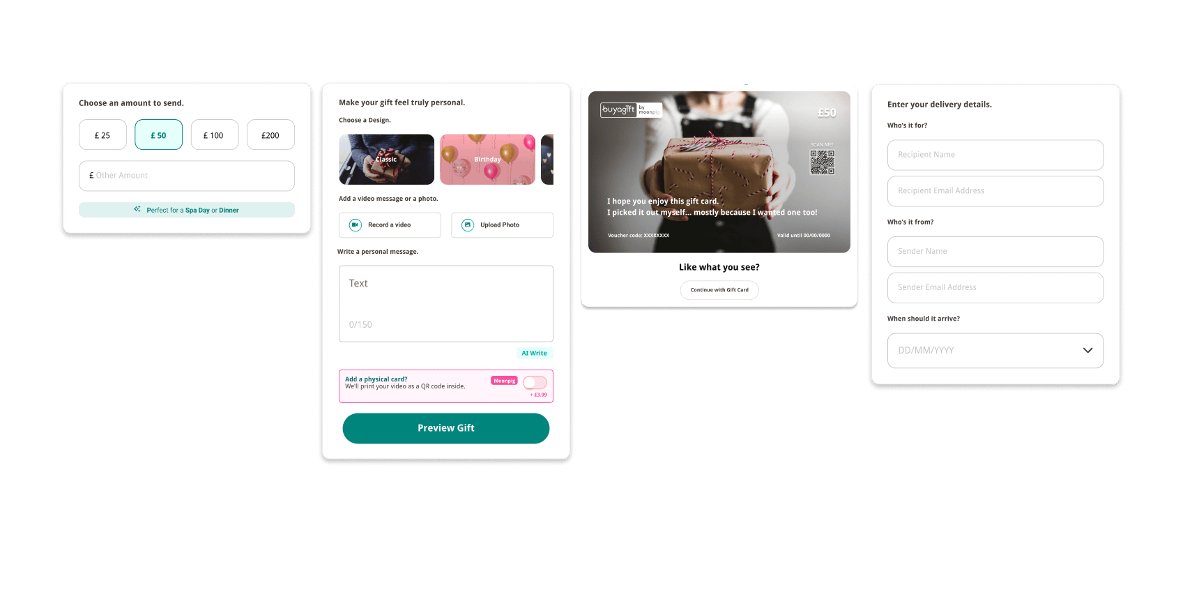
Pill selectors
All denominations surfaced as tappable pills, visible at a glance, thumb-friendly, no dropdowns. Directly addresses the discoverability gap.
Inline personalisation
Image selection and personal message built into the main flow.
Keeps users in context — building a gift, not filling in a form.
Moonpig integration
Send a digital gift card alongside a physical personalised card — all in one journey. A genuinely differentiated experience, with AOV upside.
THE CONSTRAINT
Then the world changed.
Shortly after completing the full design, the business went through a restructure. My Product Manager and Product Design Manager were made redundant. The development team was significantly reduced. The full design wasn’t going to ship.
SITUATION
Restructure mid-project. PM role made redundant. Dev capacity severely reduced.
OPTIONS
Wait for resources to return — or find a way to test the core hypothesis now, with minimal
dev effort.
MY DECISION
Going ahead with a fake door test. Validate the hypothesis cheaply. Build the business case for the full
build.
WHAT I TOOK ON
Without a PM: wrote the test brief, defined success metrics, aligned the dev team, set up
measurement. Full product ownership.

The core question I needed to answer
If users can see all denomination options on one page, will they engage more and convert at a higher rate?
Everything else — personalisation, Moonpig — could wait. First, prove this.
Fake door test
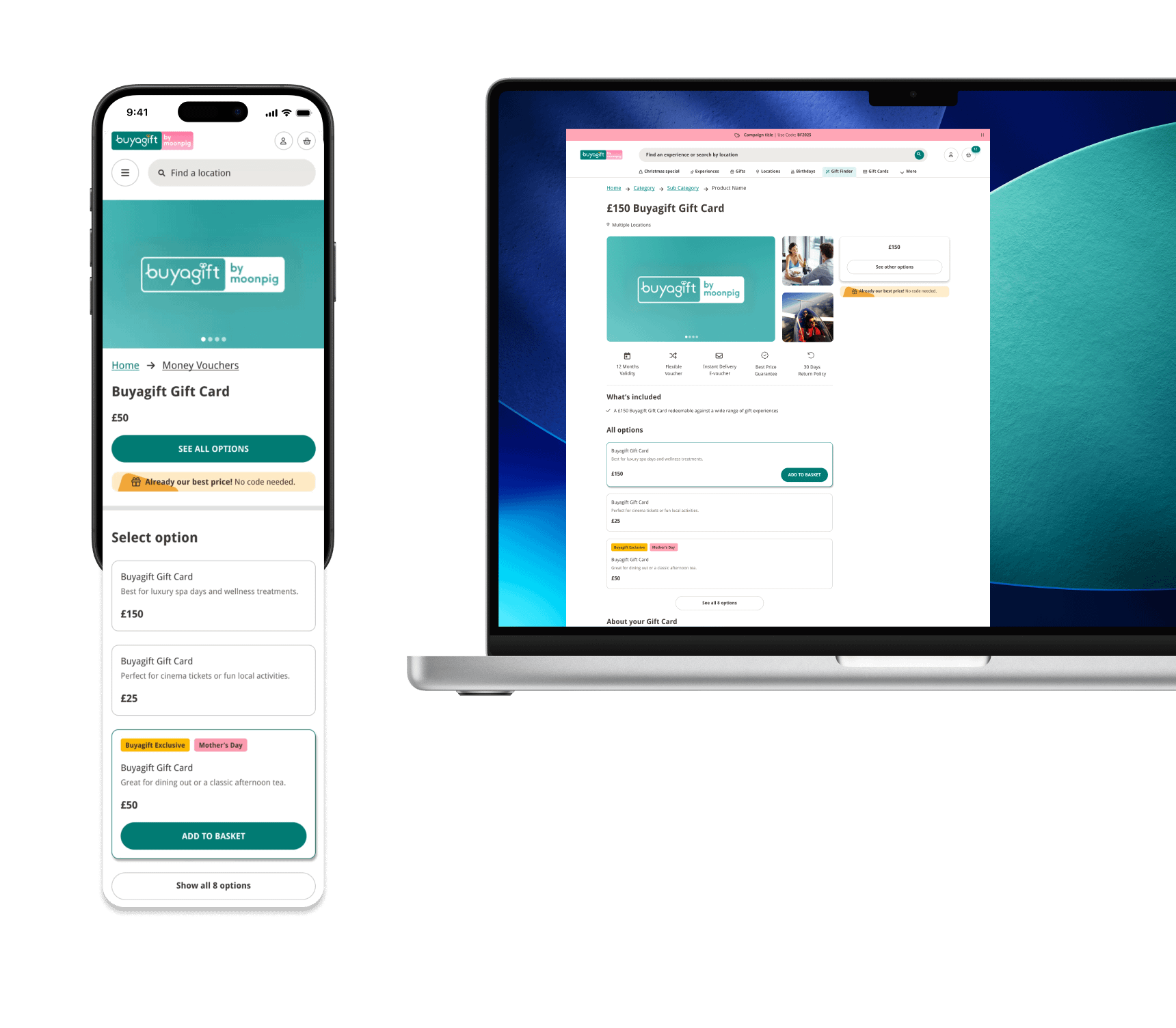
Rather than building the full redesign, we updated the page to surface all denomination options visibly, with each option anchored to the existing PDP for that SKU, pre-selecting the right denomination.
We had to adapt without any new infrastructure, backend, or component builds.
My goal was to deliver something the dev team could implement within a sprint.
Given our limitations, we couldn’t create a multiple-choice selector for pricing. Instead, I proposed using links to existing pages that users would find on the same PDP. When clicked, these links would direct users to the new page without the feeling of being redirect.
While it wasn’t the ideal user experience, it was essential to demonstrate to the business that this change was necessary and to collect data for future improvements.
Why this wasn’t a compromise
A fake door test is a deliberate tool — not a fallback. Real user behaviour data beats assumptions, even well researched ones. We’d learn more in two weeks than months of internal debate.
Why it was the right call.
Zero infra
Used existing PDPs with anchor links.
No new backend logic, no new data model.
Fast to ship
One sprint. Front-end only. Dev team could build it without scope risk.
Real signal
Actual purchase behaviour, not survey responses or prototype clicks.
7%
% increase in gift card sales over the two-week test period.
The hypothesis was validated. Surfacing denomination options on a single
page meaningfully increased purchase intent.
With the business case proven, Phase 2 was greenlit.
What this means commercially
A 16% uplift from a front-end-only change — no new features, no backend work.
The full redesign (Phase 2) is expected to exceed this baseline, with personalisation adding further conversion and AOV lift.

Building the full vision.
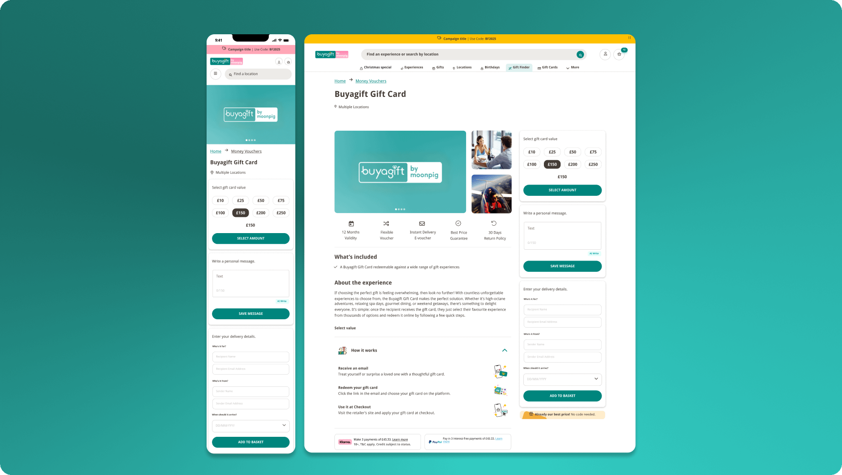
With the hypothesis proven and business case made, Phase 2 is in active development — delivering the experience the research demanded from the start.
Live
Fake door test. Denomination
options on one page, anchor links to
existing PDPs. Validated core
hypothesis.
Phase 2
Full redesigned PDP.
Pill selectors, message field, in-flow
delivery details.
Phase 3
Inline personalisation, image
selection and Moonpig integration. Complete gifting journey — digital gift card + physical personalised card in one flow.
Metrics I’m tracking in Phase 2.
Conversion rate
Gift card conversion vs. Phase 1 baseline — does the full design outperform the fake door?
Average order value
Hypothesis: personalisation increases willingness to spend more on the gift.
Feature adoption
What % of buyers use image selection and personal message? Where does the drop-off happen?

What I learned.
Constraints don’t have to shrink your ambition. They can sharpen it.
Design the full vision first
Even under constraints, starting with the right answer — then working backwards to the smallest test — produces better outcomes than letting constraints shrink the ambition upfront.
Constraints sharpen, not shrink
Constraints are creative prompts. The tight timeline and restructure forced a smarter MVP rather than a smaller one.
Take the ownership
Without a PM, I stepped into product thinking — briefs, metrics, alignment. It made the project move. It also made me a better designer.
Embrace feedback
Fake door tests are underused. They removed all guesswork and gave us stakeholder buy-in fast, without a PM to carry the message.
What I’d do differently.
Involve engineers earlier
Some Phase 2 complexity could have been resolved through earlier design-dev conversations.
I’d bring the dev team into ideation, not just delivery.
Add qualitative signal to the test
We know users converted more. We don’t know exactly why. Post-purchase surveys or a follow-up session would fill that gap and strengthen Phase 2 decisions.
Prepare for next steps in advance
Push for a small-budget Moonpig prototype in parallel so Phase 3 had a head start when Phase 2 was greenlit.

Sara Grandieri
Senior Product Designer
London, UK
Links
Contacts